Cómo crear un paisaje con lápices de colores [Esp/Eng]
 Hola a toda la comunidad de Hive DIY, muy contenta por saludarlos nuevamente. Les quiero compartir cómo hacer este dibujo de un paisaje, este tipo está entre mis favoritos para hacer. Así como me gusta apreciar un buen paisaje para tomarle fotos, también me gusta dibujarlos, es como si pudiera plasmar en el papel lo que pasa por mi mente y añadir los detalles que yo quiera. Por lo que en esta ocasión dibujé el mar con pinos alrededor y una vista montañosa de fondo. Me vino la idea aprovechando que ya la navidad se está acercando, entonces los pinos son los arbolitos de este paisaje. Espero que les guste este para que lo puedan hacer ustedes también.
Hello to the Hive DIY community, I'm very happy to greet you again. I want to share how to create this landscape drawing, which is one of my favorite types to make. Just as I enjoy admiring a beautiful landscape to photograph it, I also love drawing them, it feels like I can capture what’s in my mind on paper and add the details I want. This time, I drew the sea with pine trees around it and a mountainous view in the background. The idea came to me as Christmas is approaching, so the pines became the little trees in this scene. I hope you like it and feel inspired to try it too.


Los materiales que utilicé fueron mis colores, lápiz Motarro y sketchbook.
The materials I used were my colored pencils, a Motarro pencil, and my sketchbook.

Paso 1 ✏️
Con el lápiz de carbón, lo primero que hay que hacer es el boceto. Esta es la parte donde se va planificando todas las proporciones para luego colorear. Es importante porque aquí se tiene claro donde va cada cosa para al momento de usar los colores no hacerlo a lo loco. Me gusta no afincar tanto el lápiz para que después no se note. No agrego muchos detalles, solo contornos, porque lo que busco aquí es solo saber donde va cada cosa y de qué tamaño, los detalles los añadiré con los colores.
Step 1 ✏️
With the charcoal pencil, the first thing to do is the sketch. This is the stage where all the proportions are planned before coloring. It’s important because it helps clarify where everything goes, so when it’s time to use color, it’s not done randomly. I prefer not to press the pencil too hard so it doesn’t show later. I don’t add many details, just outlines, because here I’m only figuring out placement and size. The details will come with the colors.
 |  |
|---|

Paso 2 🌿🟢🟡
Es momento de usar los colores. Dependiendo del color prominente que se quiera utilizar en el dibujo, en mi caso verde, es por donde comenzaré. Remarcando los bordes de los pinos, montañas y arbustos con el color verde. Después rellené con amarillo en los lugares iluminados porque quería que mi dibujo llevara bastante amarillo, como si el sol estuviera fuerte y luego con el color verde claro, traté de hacer que se viera como difuminado entre el verde y amarillo.
Step 2 🌿🟢🟡
Time to use the colors. Depending on the dominant color you want in the drawing, in my case, green, that’s where I start. I outlined the edges of the pine trees, mountains, and bushes with green. Then I filled in the lit areas with yellow because I wanted the drawing to have a lot of yellow, as if the sun were strong. Then, using light green, I tried to blend it softly between the green and yellow.
 |  |
|---|---|
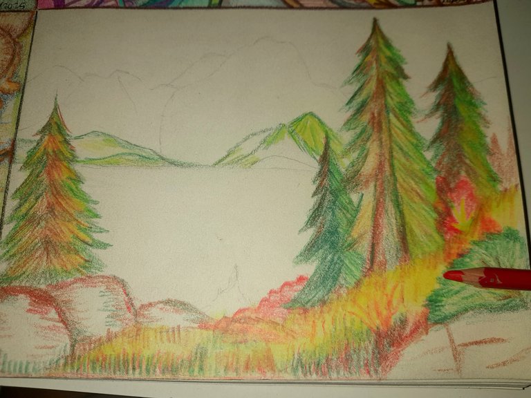 |  |

Paso 3 🌲❤️
Es momento de dar los trazos fuertes, con los colores oscuros. Para ello comencé con el marrón, en los lugares como los troncos, las rocas y hasta en las hojas de los pinos para crear sombreados y también utilicé verde pino en zonas donde no debería haber tanta luz como los árboles de fondo. El monte fue una mezcla de amarillo, marrón y verde, pero coloreé con pequeños trazos para dar ese efecto de plantas pequeñas, como grama. Además utilicé color rojo y naranja en algunas partes y me parece que le dio un toque muy bonito.
Step 3 🌲❤️
Now it’s time for bold strokes with darker colors. I started with brown in areas like the trunks, rocks, and even the pine leaves to create shading. I also used pine green in spots that shouldn’t have much light, like the trees in the background. The ground was a mix of yellow, brown, and green, but I colored it with small strokes to give the effect of tiny plants, like grass. I also added red and orange in some areas, which I think gave it a lovely touch.


Paso 4 🌊⛰️
Por último, el mar, las montañas y el cielo, todo lo que requiere colores azules. Como siempre primero contornear las montañas y luego colorear con los tonos más claros. En el mar utilicé agua marina, en las montañas azul cielo, toques de azul verde y azul real para las sombras. También quise usar morado y amarillo en algunas partes de las montañas para dar unos toques diferentes.
Step 4 🌊⛰️
Finally, the sea, the mountains, and the sky, all the elements that need blue tones. As always, I first outlined the mountains and then colored them with lighter shades. For the sea, I used aqua blue, for the mountains, sky blue with touches of teal and royal blue for the shadows. I also added purple and yellow in some parts of the mountains to give them a different touch.


Y listo este fue el resultado✏️🎨⛰️ me gusta cuando hago dibujos comenzar con los colores más claros porque si empiezo por los oscuros, al colocar uno claro encima no se va a notar, entonces prefiero hacerlo de esta manera y aprovechar más las tonalidades. De esta manera se logra esta mezcla que me gusta. Gracias por leer mi post. Hasta la próxima 🌊
And that’s it, this was the final result ✏️🎨⛰️ I like to start my drawings with lighter colors because if I begin with dark ones, the light tones won’t show well on top. So I prefer this method to make the most of the shades. That’s how I achieve the blend I enjoy. Thanks for reading my post. Until next time 🌊


Hola he estado viendo los dibujos qué últimamente has hecho y son muy buenos, tienes mucho talento, felicidades. Gracias por compartir el paso a paso de este bello dibujo
Hola Luis, gracias por ver mis dibujos. Me alegra mucho que hayas disfrutado el paso a paso. Saludos🙏🌊
Que belleza de trabajo Dani! Siempre me ha parecido increíble la capacidad de poder mezclar y combinar los colores, a mi no se me da muy bien, quizá pueda copiar alguna cosa pero nada que ver con esta belleza.
Gracias Rosa❤️💗 sí es muy bonito todo lo que se puede hacer con colores y papel. Saludos🥰⛰️🌊🙏
Te quedó bellísimo me encantan todos los colores que usaste y combinan perfecto
Gracias Miri🥰Me alegra que los colores te hayan gustado🌊⛰️
¡Hola, @danielaserena! soy espe. Me encanta tu trabajo. Me inspira ver cómo logras capturar la esencia de un paisaje en papel. También la selección de los materiales me habla de tu experiencia además la forma con la que elegiste comenzar del verde al amarillo es una excelente estrategia para crear ese efecto luminoso que lograste en tu dibujo, eres muy talentosa te felicito.
Hello, @danielaserena! I'm Espe. I love your work. It inspires me to see how you manage to capture the essence of a landscape on paper. The selection of materials also speaks to me of your experience, and the way you chose to start with green and move to yellow is an excellent strategy for creating the luminous effect you achieved in your drawing. You are very talented. Congratulations!
Hola Espe, qué alegría leer tu comentario. Gracias por tu mirada al dibujo🤗🥰⛰️
Wow! This is such a wonderful drawing friend, you are truly talented, it’s such a privilege to witness the birth of this beautiful drawing.
Great work friend.
selected by @ibbtammy
Gracias 🤗 Fue un proceso muy entretenido hacer este dibujo, poder compartirlo con la comunidad de Hive lo hace aún mejor. Saludos🙏
Hermoso dibujo. Excelentes fotos. Dios te bendiga
Amén 🙏 muchas gracias. Saludos
Saludos @danielaserena, me gustó el dibujo se ve genial, tienes lindos trabajos en el block.
Feliz noche!
Gracias @samuell12 , me alegra que hayas visto los dibujos de mi blog. Saludos
Que hermoso dibujas y ame tus colores. El paisaje tiene unos tonos que atrapan
Gracias🥰🌊