Close Textures in black & white II [ENG-ESP]
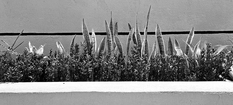
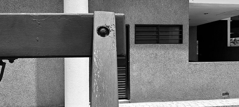
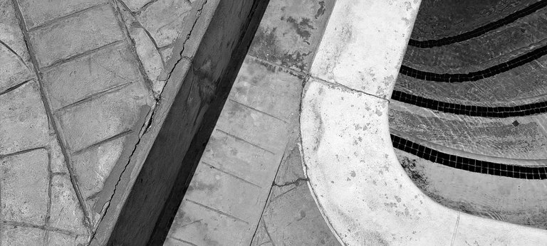
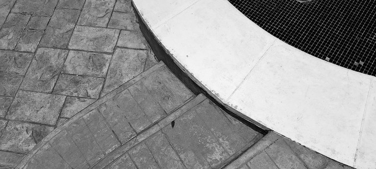
This is the second part of the black and white textures and it seems that I left the best for this post, however it was due to the same typical process when one goes out to take pictures. Always the first ones are not the best, as it's as if one is warming up; I don't know if all photographers go through the same thing. As I take more photos that day, I get better framing and almost always the last ones are spectacular.
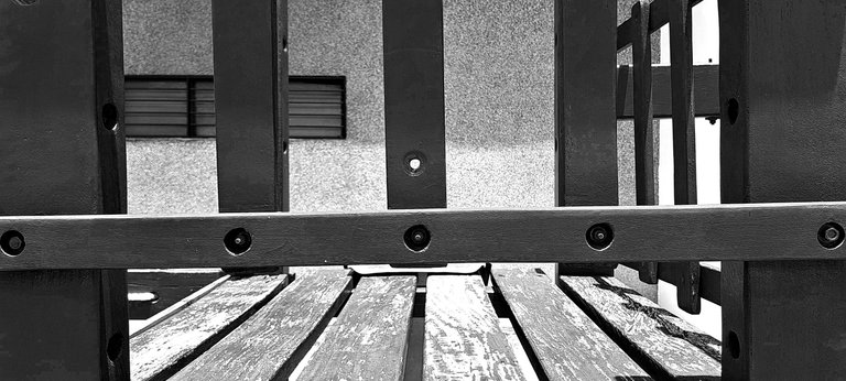
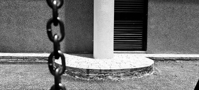
The hardest thing about this type of photography is to keep your shadow out. In the third photo you can see my phone, but it looks good next to the other shadows. In some I had to use a different angle and not so perpendicular. Also the time and position of the sun made the process a bit difficult, but I am happy with the result.
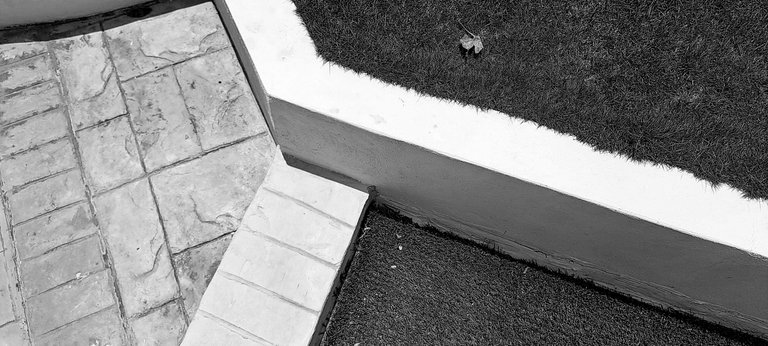
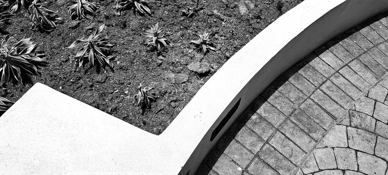
This type of photography can work for many environments. I love the geometric lines and spaces that can be formed. This would even work for sketching posters for graphic design. It could be a layout in editorial design, or backgrounds for advertising design; they could also be used as grids. It just occurred to me that it would be spectacular to send it as a project to Graphic Design students.
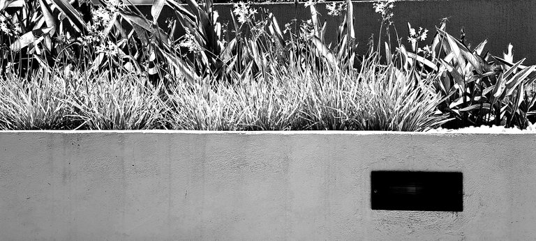
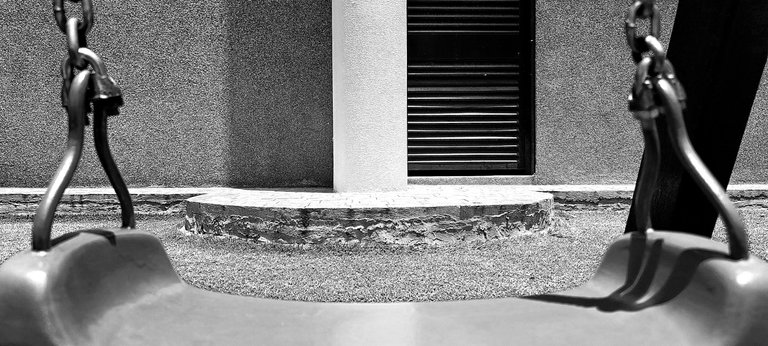
I'm going to explore more on this type of photography. I have already published several sessions in the past, but in color. I think black and white has more impact. Maybe it's also because it reminds me of my
Español
Esta es la segunda parte de las texturas en blanco y negro y pareciera que dejé lo mejor para este post, sin embargo fue debido al mismo proceso típico de cuando uno sale a tomar fotos. Siempre las primeras no son las mejores, ya que es como si uno estuviera calentando; no sé si a todos los fotógrafos les pasa lo mismo. A medida que tomo más fotos ese día, mejores encuadres realizo y casi siempre las últimas son espectaculares.
Lo más difícil de este tipo de fotografía, es que no salga tu sombra. En la tercera foto se puede ver mi teléfono, pero queda bien junto a las otras sombras. En algunas tuve que usar un ángulo diferente y que no sean tan perpendiculares. También la hora y posición del sol, dificultaron un poco el proceso, aunque estoy contento con el resultado.
Este tipo de fotografías puede funcionar para muchos entornos. Me encantan las líneas y espacios geométricos que se pueden formar. Incluso esto serviría para bocetear carteles para el diseño gráfico. Pudiera ser un maquetado en diseño editorial, o fondos para diseño publicitario; también se podrían usar como retículas. Incluso se me acaba de ocurrir que sería espectacular para mandarlo como proyecto a los estudiantes de Diseño Gráfico.
Voy a explorar más en este tipo de fotografía. Ya en el pasado publiqué varias sesiones, pero a color. Creo que en blanco y negro tiene mayor impacto. Quizás también es porque me recuerda a mi época de estudiante.


Posted Using InLeo Alpha
Muy buenas imágenes sobre todo por el contraste de luz y sombra, últimamente no he tenido animo para hacer fotos, apenas hice una publicación en mi blog, creo que tenemos muchos temas para el proyecto si aun estas interesado,
Apareciste 😱
Sí claro, sigo interesado